BACK

Case Story 
PPL Electric Utilities

desktop & mobile flow

View Prototype
iphone mockup
A list of numbers from one to five

overview


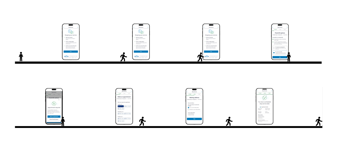
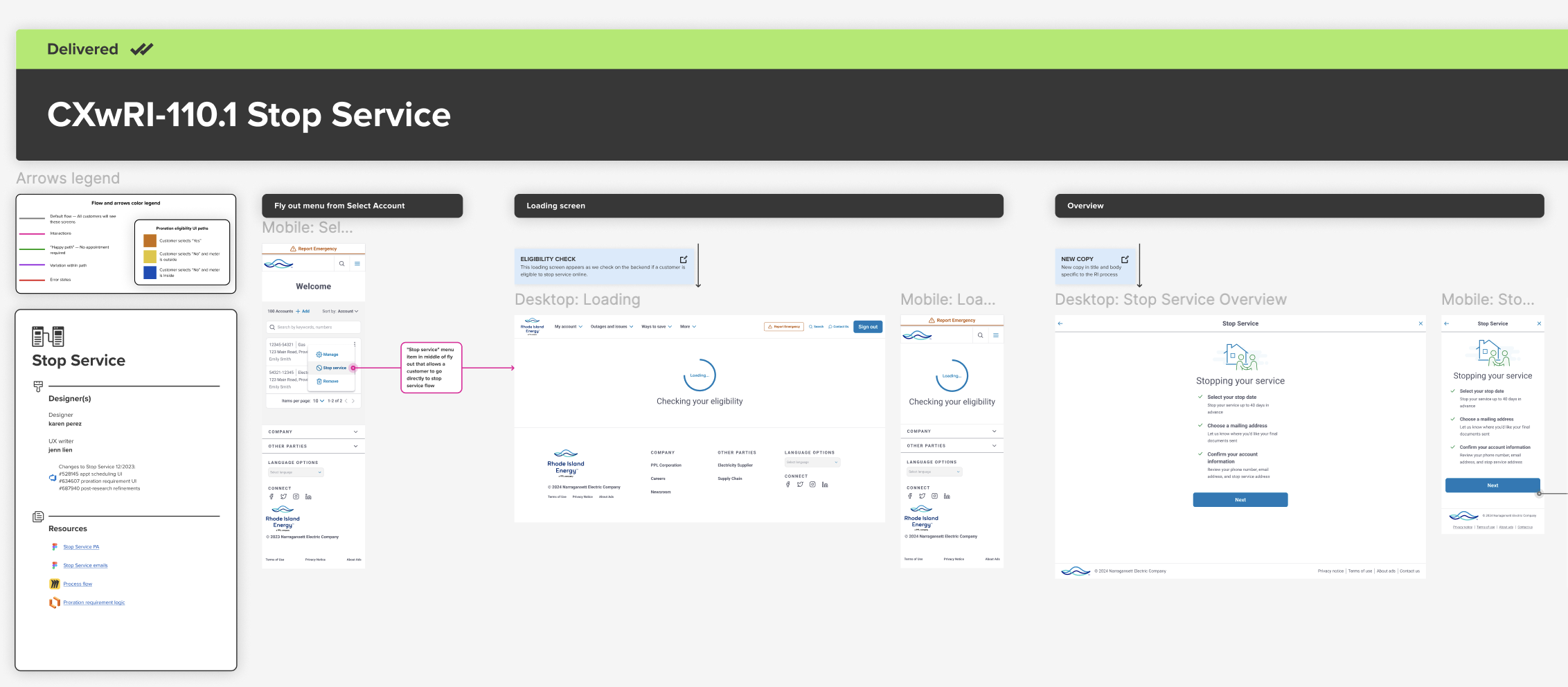
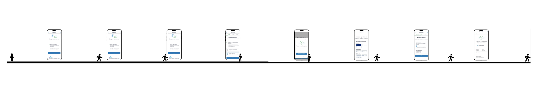
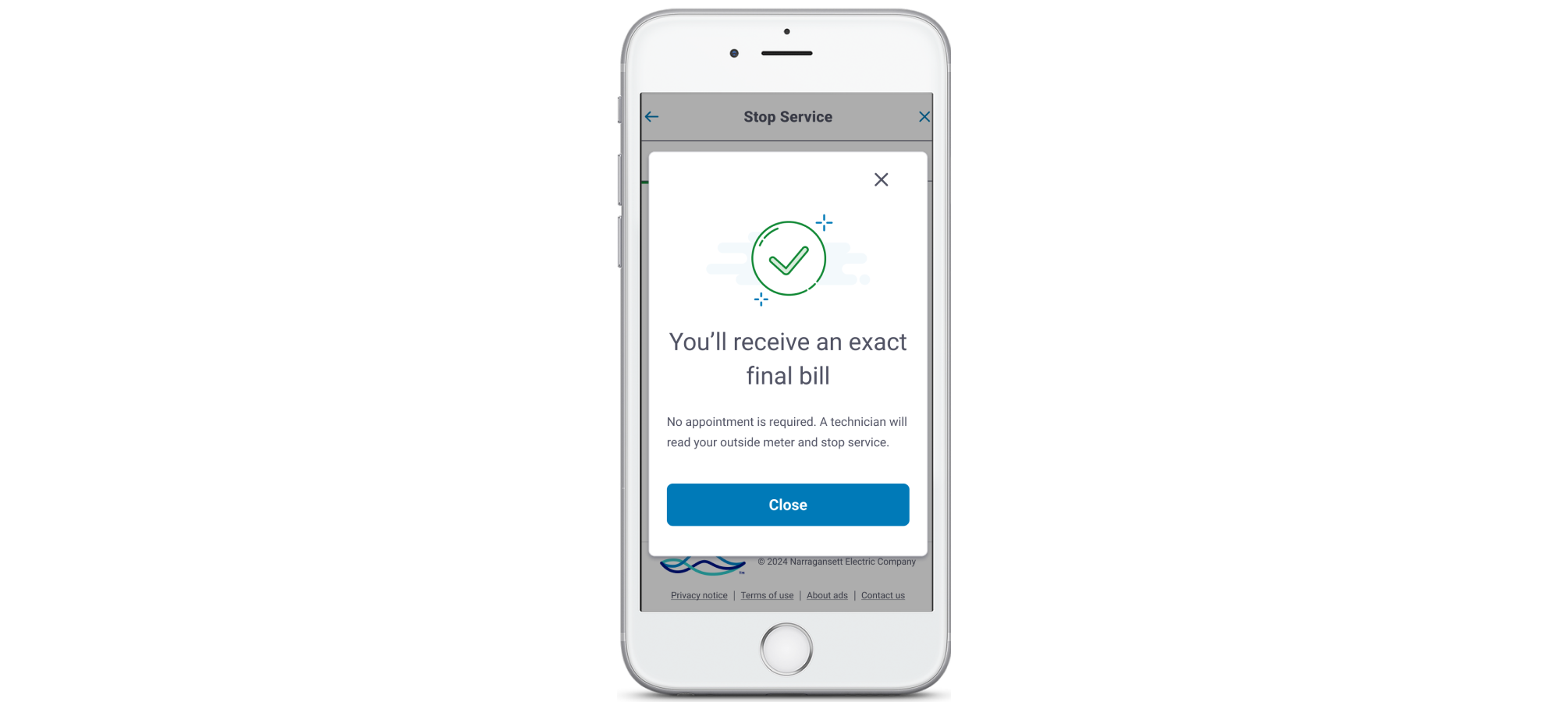
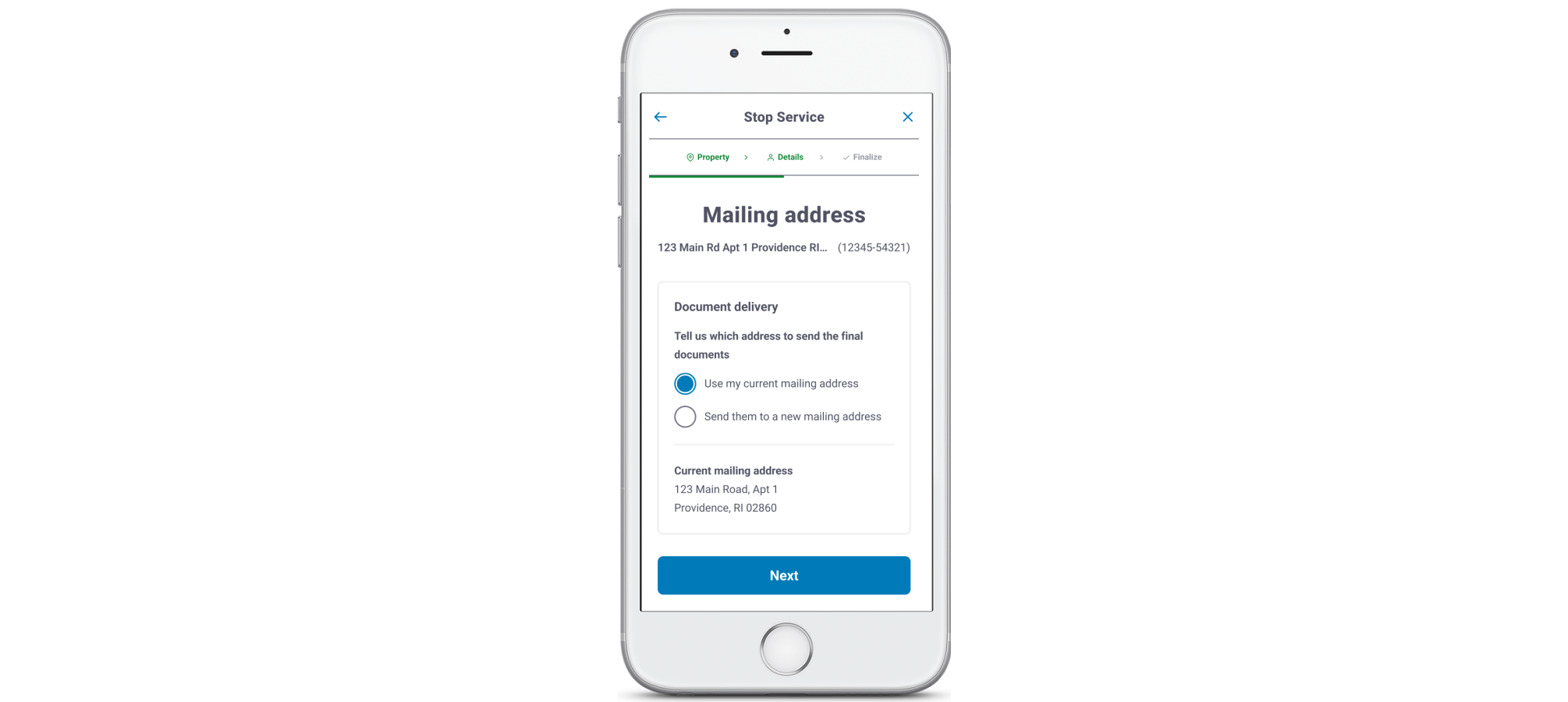
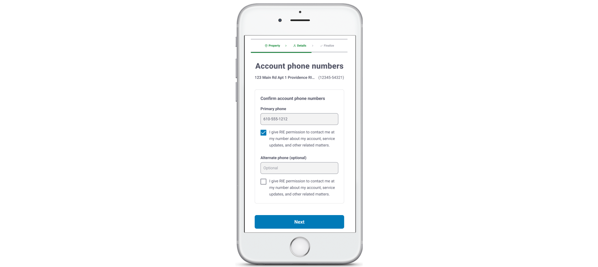
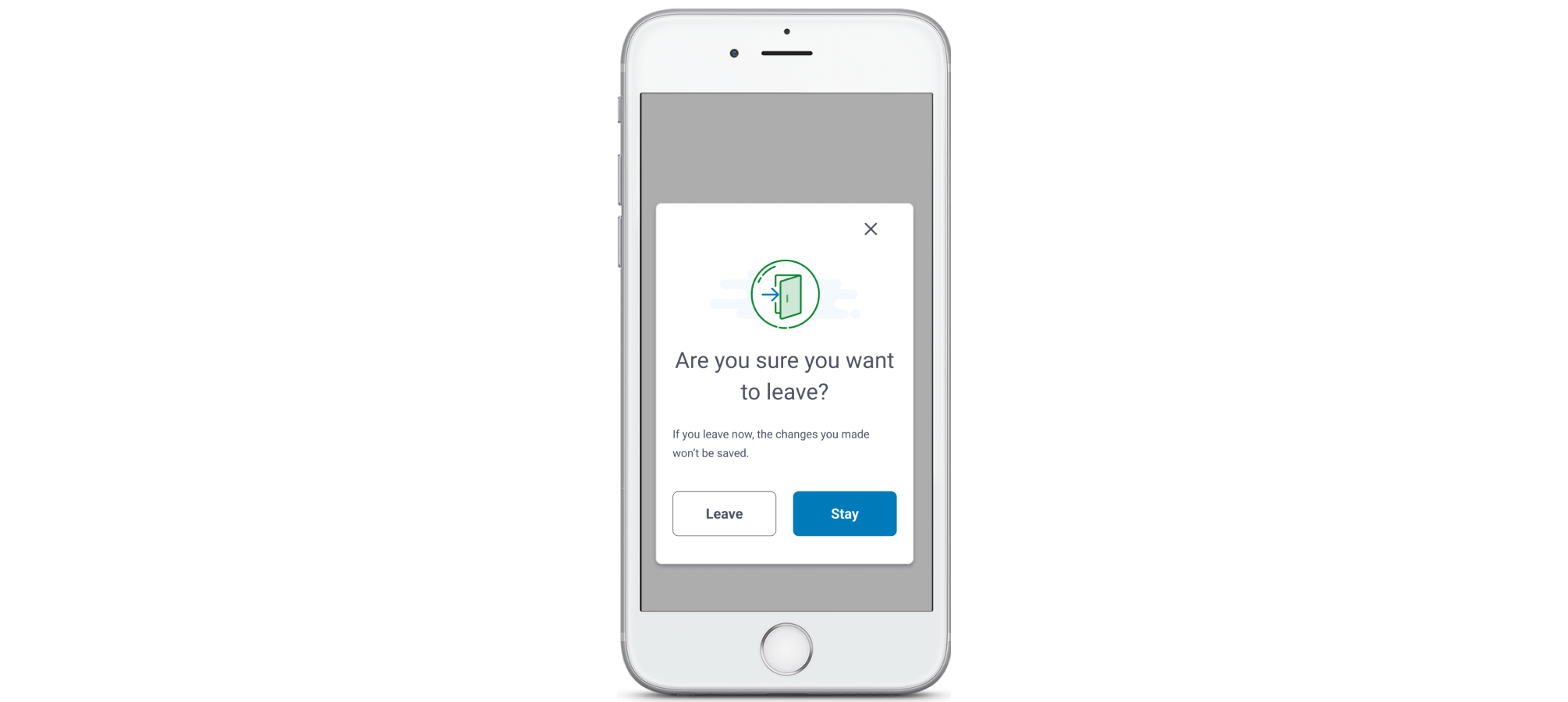
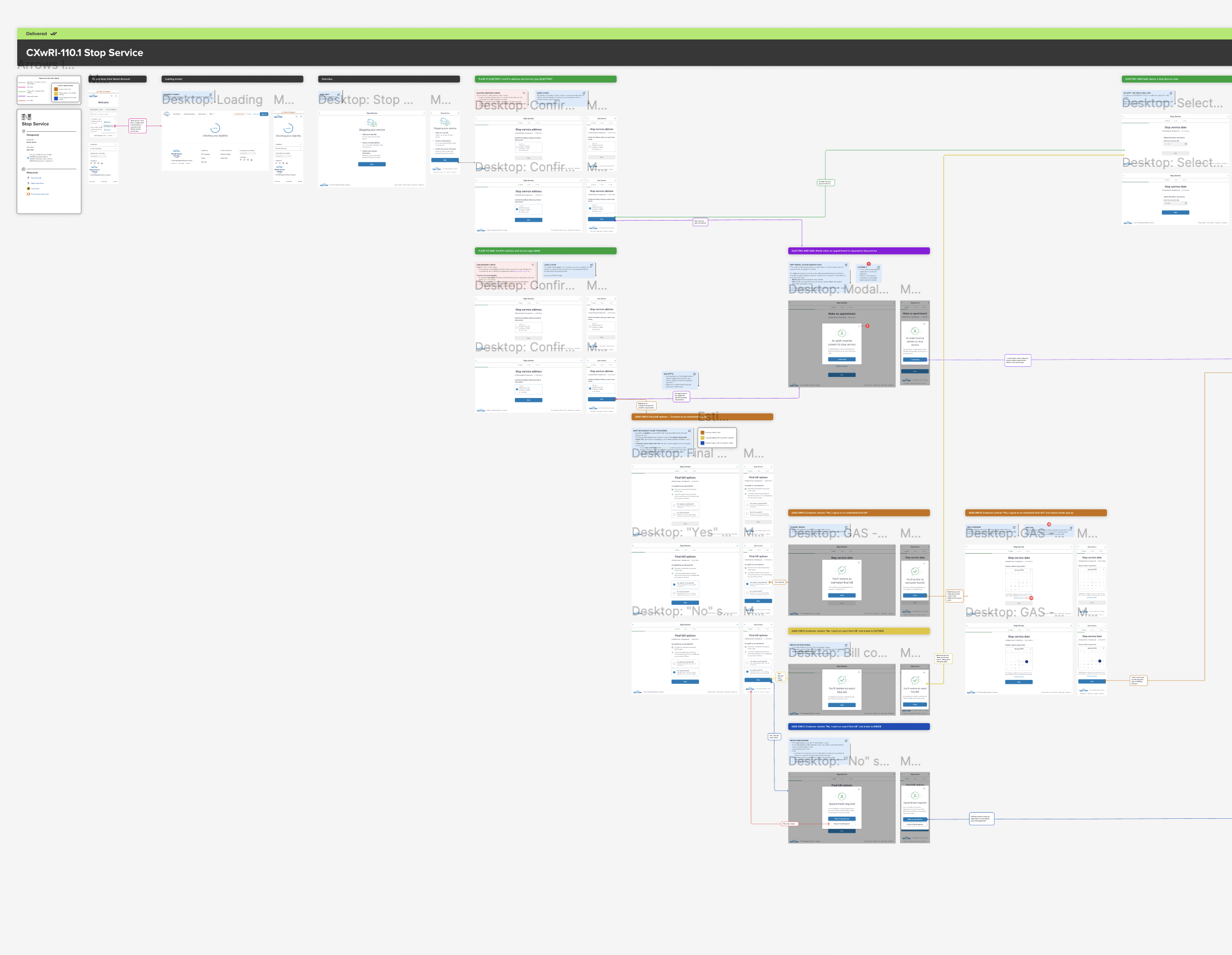
As part of a broader digital modernization effort for a PPL subsidiary, I led the UX writing and content strategy on a redesigned Stop Service flow that would serve both electric and gas customers.

The previous experience was fragmented, confusing, and visually outdated. Our goal was to align it with the improved design patterns already in use elsewhere on the site — while solving key usability pain points that directly affected call volume, error rates, and customer satisfaction.

This project required deep collaboration with my UX designer partner, especially in Figma where we co-developed and annotated flows. While I contributed to the interaction design itself, my primary focus was simplifying information architecture, writing clear and context-sensitive copy, and ensuring the content logic held up across multiple technical edge cases and backend conditions.

My work included:

  • Rewriting and restructuring flow content for clarity and accessibility
  • Collaborating with product designers to align copy with interaction patterns
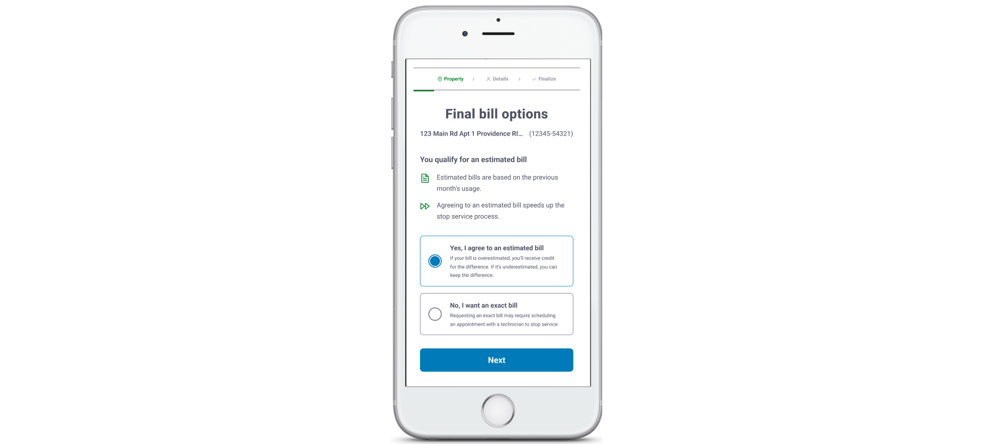
  • Developing UX copy that accounted for edge cases and emotional moments
  • Supporting usability testing and iterative content updates based on findings

Our work resulted in a significantly clearer experience, validated by usability testing and stakeholder feedback.

A blank grey image

project goals


One of our primary goals was to build a single, flexible Stop Service flow that could handle multiple use cases: electric-only customers, gas-only customers, and dual-service customers. We wanted the experience to feel seamless regardless of which services a customer was stopping.

Another major goal was to reduce calls to customer support. The existing flow left people unsure whether they needed an appointment or how their final bill would be calculated. Much of our copy work focused on proactively answering those questions before they created friction.

We also wanted to build trust by reflecting the customer’s real-world mental model. Instead of organizing screens by backend logic or internal labels, we designed the experience around what users care about: their address, meter location, and stop date.

A blank gray square

context

The Stop Service flow is one of the most important transactional experiences on the site. It’s used by customers who are moving or transferring utilities — and they often arrive stressed, distracted, or on a tight deadline.

The existing flow was a major pain point. Customers didn’t understand what actions they needed to take, and the interface didn’t explain the downstream effects of their choices (for example, whether they’d need to schedule an appointment for meter access).

As we audited the original flow, we collaborated with our researcher to gain great initial insights.

View Research Files
View Research
View Research Files
A blank gray square

process

Our first step was mapping the existing experience and identifying decision points, drop-offs, and mismatched language. I worked with the designer in Figma to layer in backend logic, conditional paths, and pain points — all annotated directly in the flow.

We then collaborated with engineering and business analysts to understand the backend rules governing electric and gas customers. For example, only some gas customers were eligible for prorated billing, and appointment requirements varied depending on whether a meter was indoors or outside.

Finally, we ran usability testing and stakeholder reviews in parallel. After each test cycle, we annotated flows with callouts showing what changed and why, making it easier for developers and PMs to follow the logic.

And of course, we relied on our stellar researcher, Danny, to help us synthesize the data into something we could present to the business.

More Research

constraints

We had to work within a number of limitations, both technical and visual. The Stop Service flow needed to use components already live elsewhere on the site, including headers, buttons, and modals. Backend logic determined which screens customers would see based on their eligibility.


Proration rules (gas backend logic)
This shows the rules for determining whether a gas customer qualifies for prorated billing and how their experience diverges.


Appointment logic (electric & gas)
Customers with indoor meters are required to book an appointment.


Error states
We designed (and I wrote) inline error messages that validate on blur and explain how to fix customer issues, improving clarity and accessibility.

A blank gray square

design principles

We aligned on a set of principles to guide the redesign: clarity, consistency, and proactive guidance. Customers didn’t just need to complete a task — they needed to feel confident they’d done it right.

We focused heavily on matching mental models. For example, we placed the stop service address upfront to reassure customers they were making changes to the right property. Visual cues (such as icons and section dividers) made complex steps feel more digestible.

We also avoided overwhelming users with choices. Instead of asking users to decide between appointment types, we asked one simple question at a time and used backend logic to determine the path forward.

Lastly, I worked with colleague writer to expand our writing guidelines and principles documentation, which heavily informed our process.

UX Writing Principles
A blank gray square

content design

I wrote all screen-level and inline content across both mobile and desktop versions. This included instructional text, button labels, radio options, error messages, modal copy, and confirmation screens.

Most content challenges came down to timing and tone. For example, the phrase “You qualify for an estimated bill” needed to be warm, clear, and accurate — but not misleading. We revised copy repeatedly to clarify what was being estimated, how the total would be calculated, and what actions the user could take.

We also wrote modals that clarified logic without adding burden. For customers with outdoor meters, a modal let them know they didn’t need to be home. This small bit of added information helps them avoid unnecessary appointments and save time they may have wasted.

A blank gray square

outcomes

The redesigned flow led to a sharp drop in confusion points during testing. Users were better able to explain what was happening and why — especially around final bill logic and appointment requirements.

Stakeholders praised the modularity of the flow, and the annotated Figma files became a reference for future transactional designs. Our decision to anchor each step in clear, empathetic content helped elevate trust and reduce cognitive load.

final screens

Before: Unclear what happens after making a selection.
After: Now includes billing logic and refund details for over/underestimates.

Before: Generic message with no meter context.
After: Personalized message confirms whether an appointment is required.

Before: Confusion around which documents would be mailed vs. sent digitally.
After: Clarified that paperless users may still receive documents by mail.

Before: Didn’t say if alternate phone was optional.
After: Label updated to make optionality clear from the start.

measurable results

Modals

The final bill modals were measurably clearer than before. Copy changes to modals helped clarify next steps and meter access responsibilities. Users were better able to explain what happens after choosing “Yes” or “No.”

Drop-offs

Users clearly understood the difference between estimated and exact bills, resulting in fewer drop-offs. More people completed their online transactions without needing to phone in for help.

(Our customer help team loved this!)

User journey

Our redesign and content edits improved clarity and flow. The final version paths tested higher than previous versions in perceived clarity, resulting in an overall improved user journey.

A blank gray square

the power of content


This Stop Service revamp was one of the most cross-functional and logic-heavy flows I’ve ever worked on.

Every decision, from radio label text to modal sequencing, had to account for backend logic, conditional edge cases, business requests, and legal requirements. Of course, we prioritized user experience above all. I’m proud of how seamlessly our team collaborated, especially when mapping logic paths and drafting annotations. Instead of throwing in random copy and design features, we built it in the wireframes together and pressure-tested the narrative as a unified experience.

This project reminded me how powerful content can be — not just because clarity and readability are important, but because good content design helps customers reach their end goal...

...which is always my goal when designing content!

Our Kickstarter
Eight screens in a mobile prototype