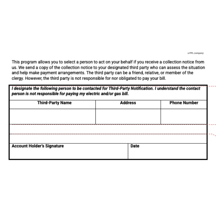
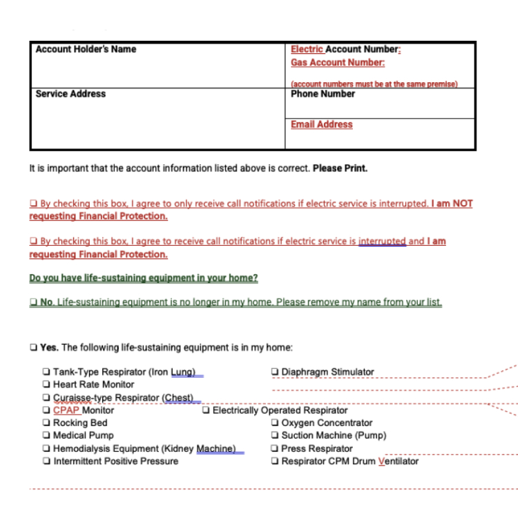
BACK

Case Story 
Kentucky Utilities

UX design & content strategy

iphone mockup
A list of numbers from one to five

overview


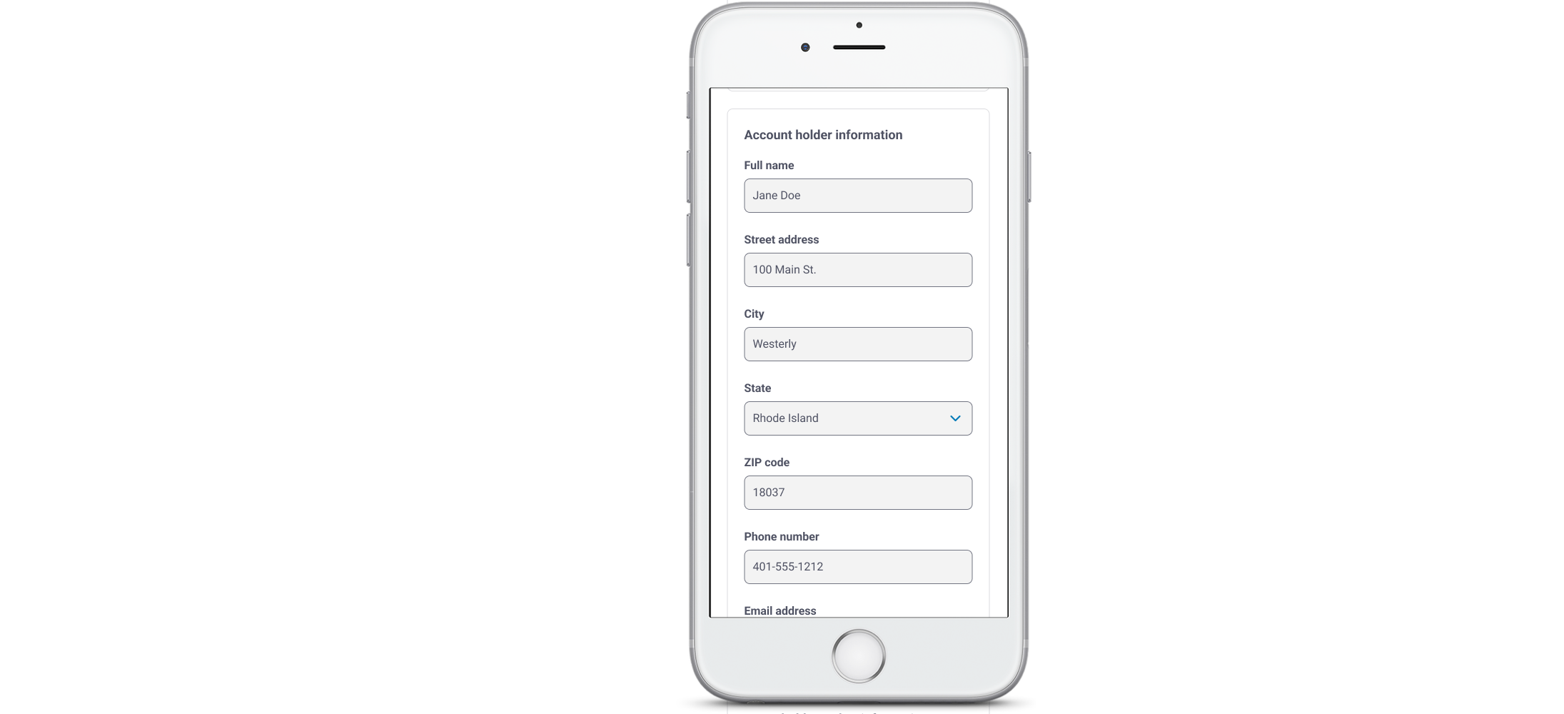
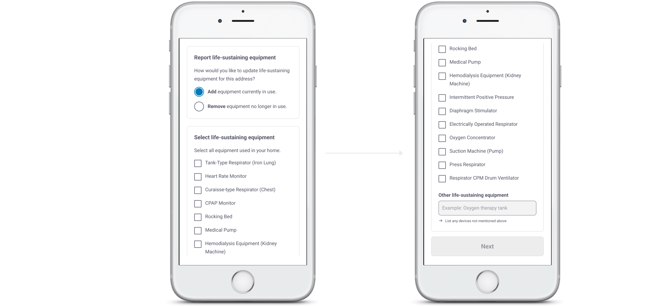
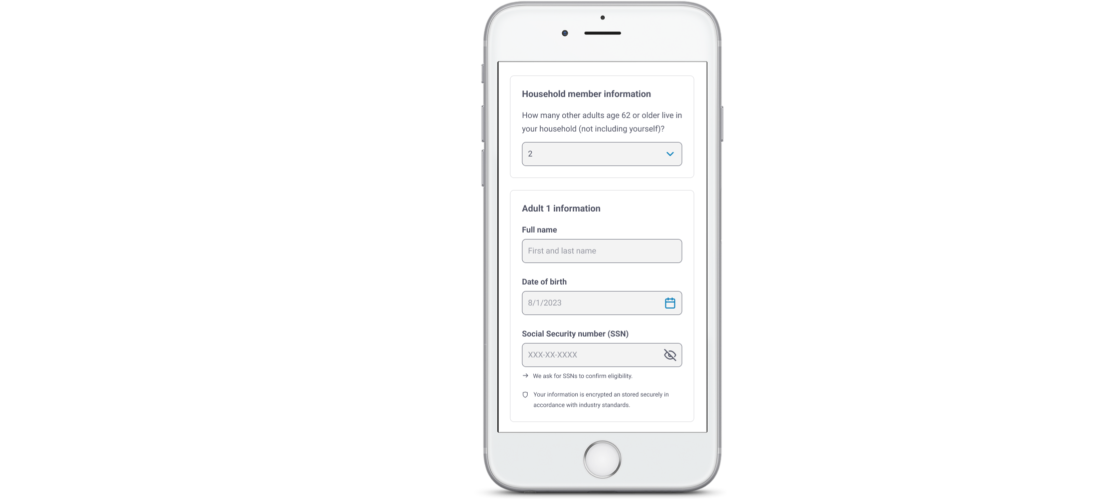
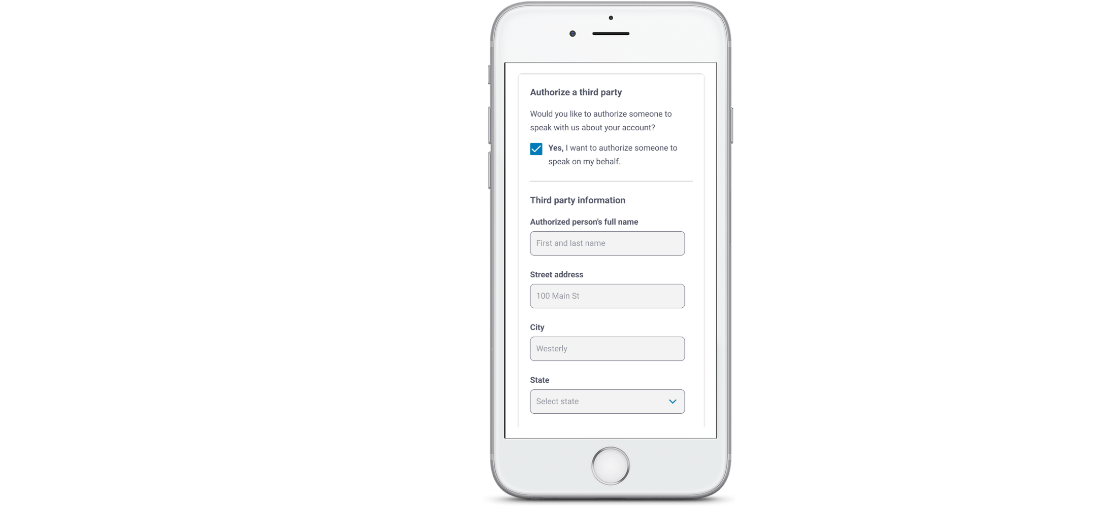
Louisville Gas & Electric and Kentucky Utilities (LG&E and KU) needed a complete digital overhaul of their paper-based Life-Sustaining Equipment form — a critical document used to identify customers who rely on electrically powered medical devices. The form’s legacy experience was confusing, inaccessible, and burdensome for customers already navigating high-stress medical circumstances.

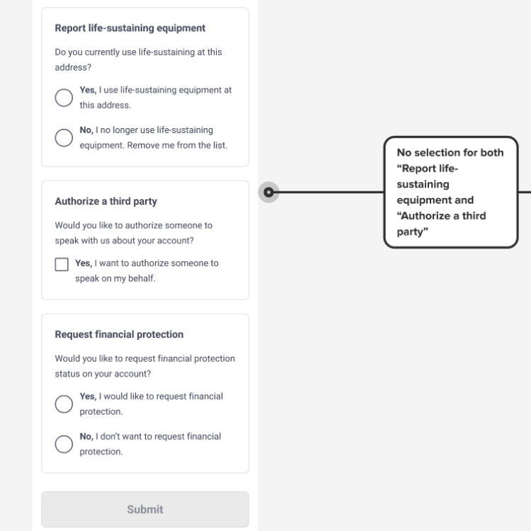
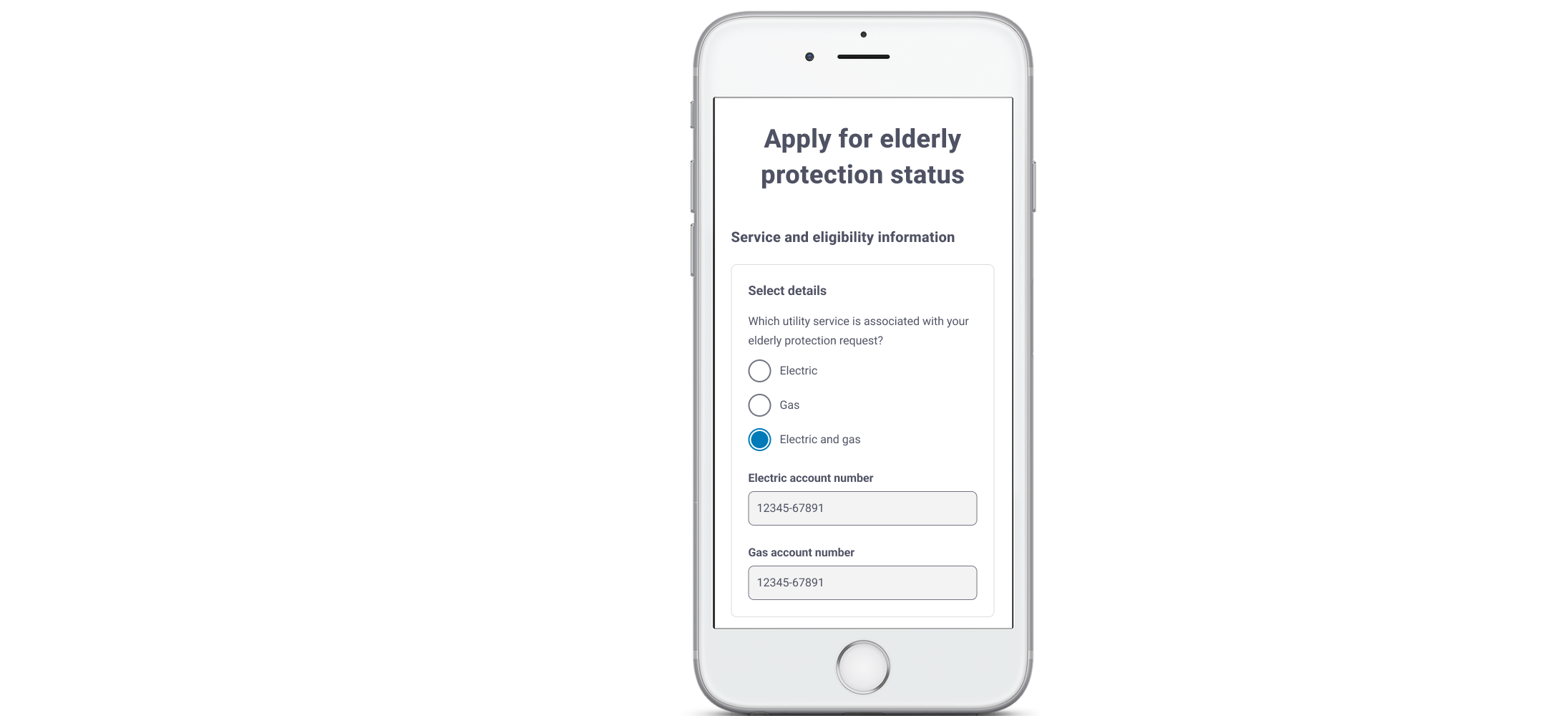
As the Senior UX Writer and content designer, I led the end-to-end content strategy and partnered closely with a UI designer and our team lead to create a modern, web-based flow tailored specifically for LG&E and KU customers.

Our solution brought clarity to a previously clunky process, improved accessibility, reduced incomplete submissions, and gave customers a seamless way to apply for protection online.
A blank grey image

project goals


This wasn’t just a digitization effort. It was a complete reimagining!

Our goals were to:

  • Migrate the outdated PDF form to a modern, web-based experience
  • Make the content accessible, empathetic, and easy to understand
  • Ensure full compliance with Kentucky and utility-specific regulatory requirements
  • Reduce call volume by proactively answering common questions in the interface
  • Create an experience that could scale across electric and gas services with minimal complexity
A blank gray square

 context


The original LSE form was a multi-page PDF packed with dense legal text, inconsistent formatting, and zero interactivity. Customers were expected to:

  • Print the form and fill it out by hand
  • Navigate unclear instructions and confusing language
  • Guess which sections were required, optional, or conditionally triggered
  • Submit separate documentation for financial protection or third-party authorization
The result? High call volume, slow processing times, and a constant backlog of incomplete submissions that required manual follow-up.
Original documentView Research Files
A collage of colorful sticky notes

challenges

Untangling legacy content

The form was overloaded with outdated legal language, redundant disclosures, and unclear instructions.

Customers understandably struggled to understand what the form required of them. As a UX writer, I had to carefully dissect and rewrite content to preserve compliance while drastically improving readability and flow.

Designing for trust

The form asked for highly sensitive information, including Social Security Numbers.

This introduced hesitation and potential drop-off. My UX writing needed to reassure customers through transparent, plainspoken copy that explained why data was requested and how it would be used — without sounding alarming.

form Flexibility for Services

Designing for customers reporting different types of services added complexity to the flow.

As the UX designer and writer, I had to build logic-based content variants and label systems that adjusted dynamically based on service type — ensuring all customers received clear, relevant instructions without introducing confusion.

A blank gray square

  process

We kicked off the project by auditing the original form to surface content, usability, and accessibility pain points. I partnered closely with our UI designer to restructure the experience into intuitive, digestible sections. We used progressive disclosure to minimize cognitive load and introduced opt-in modules for tasks such as third-party authorization and financial assistance.

From the start, we embedded research into the design process. Our UX researcher conducted moderated usability testing with a diverse group of participants, including seniors, caregivers, and customers with limited digital access. These sessions revealed key friction points, emotional triggers, and comprehension gaps — especially around medical terminology and required fields.

Guided by those insights, I rewrote the form in plain language, clarified sensitive areas with reassuring microcopy, and refined the interaction flow. Throughout, I collaborated with legal, compliance, and Adobe Forms stakeholders to ensure the experience met LG&E/KU’s regulatory and technical standards without compromising clarity or empathy.

A blank gray square

 design principles

Our approach was grounded in three key principles:

  • Clarity over cleverness:
    Every label and message was designed to reduce anxiety and increase comprehension, especially for customers under medical stress.
  • Empathy for urgency:
    The tone was warm but direct — professional enough to satisfy legal teams, but human enough to make customers feel supported.
  • Minimize cognitive load:
    Using progressive disclosure, grouped sections, and embedded helper text, we made the experience easier to navigate and complete accurately.
A blank gray square

content design highlights

Our key improvements included:

  • Rewriting dense legal text into readable, reassuring plain language
  • Converting yes/no questions into opt-in statements that made action and intent clearer
  • Consolidating duplicative sections to reduce fatigue
  • Creating dynamic sections that adjusted based on service type (Electric, Gas, or both)
  • Providing a clear success message with next steps, including how to get a provider’s signature

final product

Before: A dense, static PDF filled with legalese, with no digital submission option and no way to confirm next steps.

After: A guided, accessible online experience in Adobe Forms, featuring conditional logic, plain language, and real-time validation.

A blank gray square

  results

By focusing on clarity and usability, we delivered a streamlined experience that enhanced customer outcomes, minimized risk, saved time, and laid the groundwork for future scalable solutions.

Within weeks of launch, LG&E/KU saw significant, measurable improvements across the board:

  • Form completion time dropped from ~18 minutes to under 5 minutes
  • Successful self-submissions tripled in the first 30 days
  • Incomplete submissions decreased by 36% thanks to clearer guidance and validation
  • Customer support calls related to the life-sustaining equipment form process dropped by 25%
  • Positive ROI achieved through reduced call volume and faster internal processing
  • Accessibility and legal teams flagged the form as a model for future high-sensitivity documents
  • Reusable components from this project are now informing other LG&E/KU protection-related flows
A blank gray square

  final thoughts

This project demonstrates the impact of thoughtful UX design, UX writing, and cross-functional collaboration in transforming clunky, compliance-driven processes into user-friendly digital experiences.

By centering the emotional context of LG&E/KU’s most vulnerable customers, we created a form that fosters trust and reduces errors.

The success of this project also sparked new interest in improving other outdated forms. Our digital solution showed how thoughtful design can boost accessibility for customers, save time for employees, and drive bigger wins across the organization.